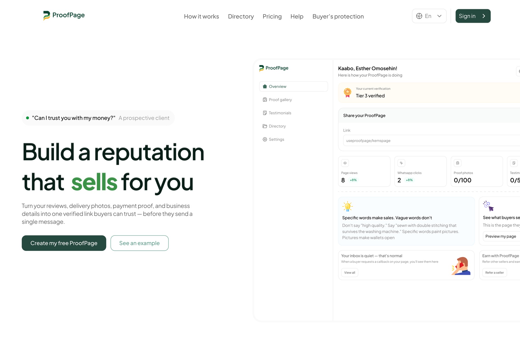
Project snapshot
Trust, made visible instead of implied.
ProofPage is a marketplace trust and verification experience. It helps buyers understand whether a vendor is credible before they contact, book, pay, or commit, replacing vague labels with actual proof.
The reality
A “Verified” badge tells a buyer almost nothing.
In most marketplaces, buyers are asked to book or pay with very little actual information to base the decision on. A profile might look polished and carry a badge, but the buyer still has real questions: what was checked, what happens if something goes wrong, and can this vendor be compared with another confidently?
Trust signals were present, but trust was too vague to act on. One word was being asked to answer six questions at once.
The design challenge
Turn one vague label into a system buyers can reason with.
The system needed enough detail to make trust understandable, without burying buyers in so much evidence that the page became harder to scan than it was to trust.
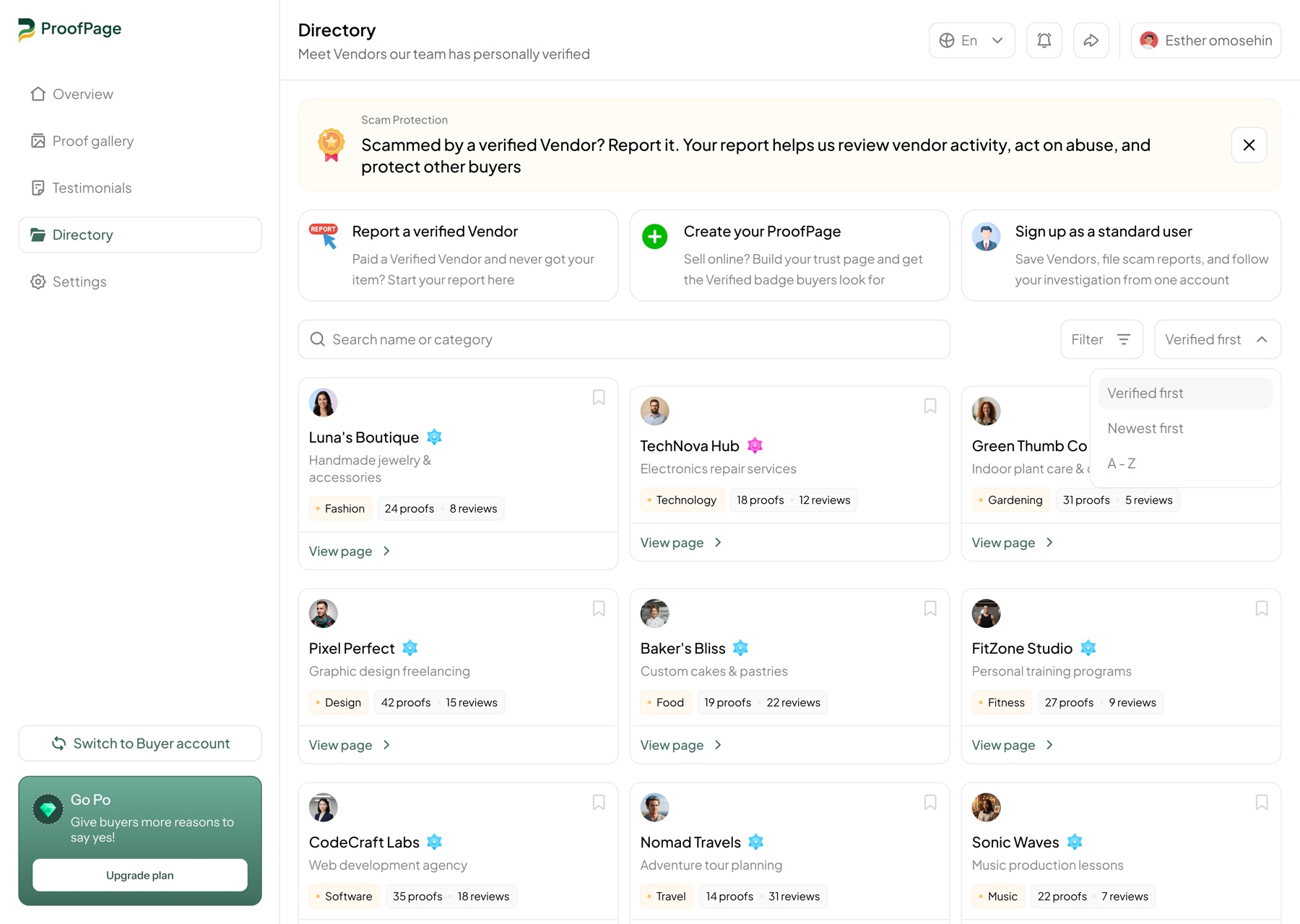
Key decision 01
Separate verification from protection.
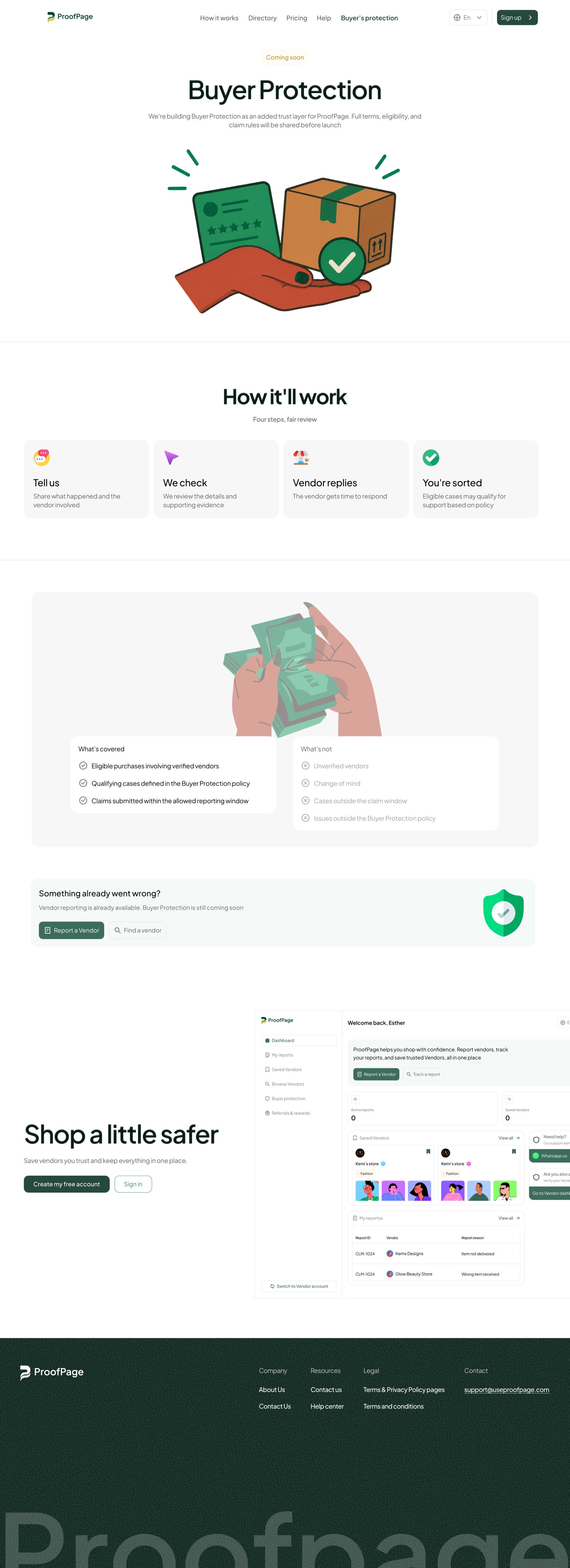
A vendor can be fully verified and still not have every transaction protected. Those are different guarantees. Verification explains whether the vendor has been checked and at what level: verified, partially verified, pending, not verified, or unavailable. Buyer protection explains what support exists if something goes wrong, with its own coverage details, limits, and conditions.
Two guarantees, not one. Each gets its own explanation instead of collapsing into a single badge.
Key decision 02
Every state explains itself.
A status label with no explanation only relocates the vagueness. Every verification state was designed to explain in plain terms what it actually means, so the buyer never has to interpret a badge on faith.
Key decision 03
Proof became a scannable system, not a wall of evidence.
Ratings, reviews, completed work, response rate, identity checks, and uploaded documents can all support credibility. Dumped together they overwhelm rather than reassure. I designed these signals to scan quickly, with the option to go deeper only when a buyer needs it.
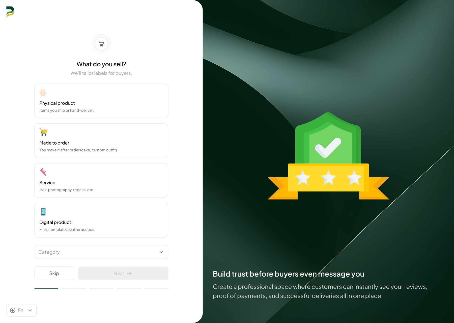
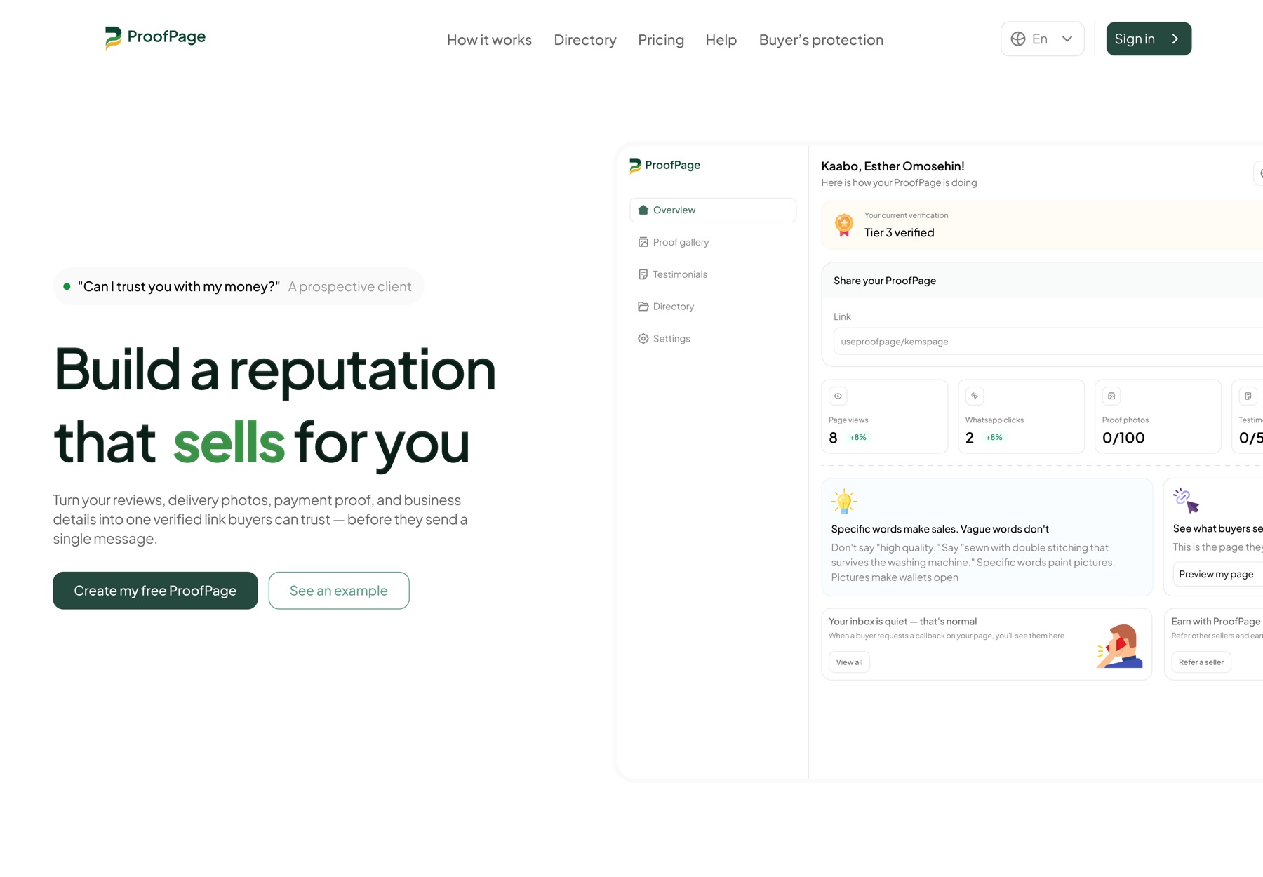
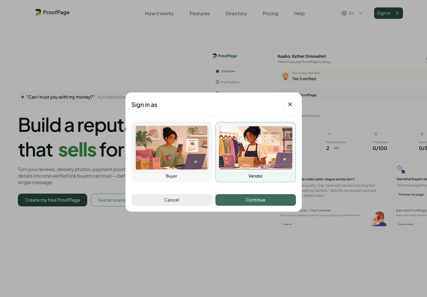
Public entry and account choice
A clear promise before asking someone to sign in.
The public experience explains what ProofPage does, then lets people enter as a buyer or vendor without collapsing two different trust journeys into one account flow.
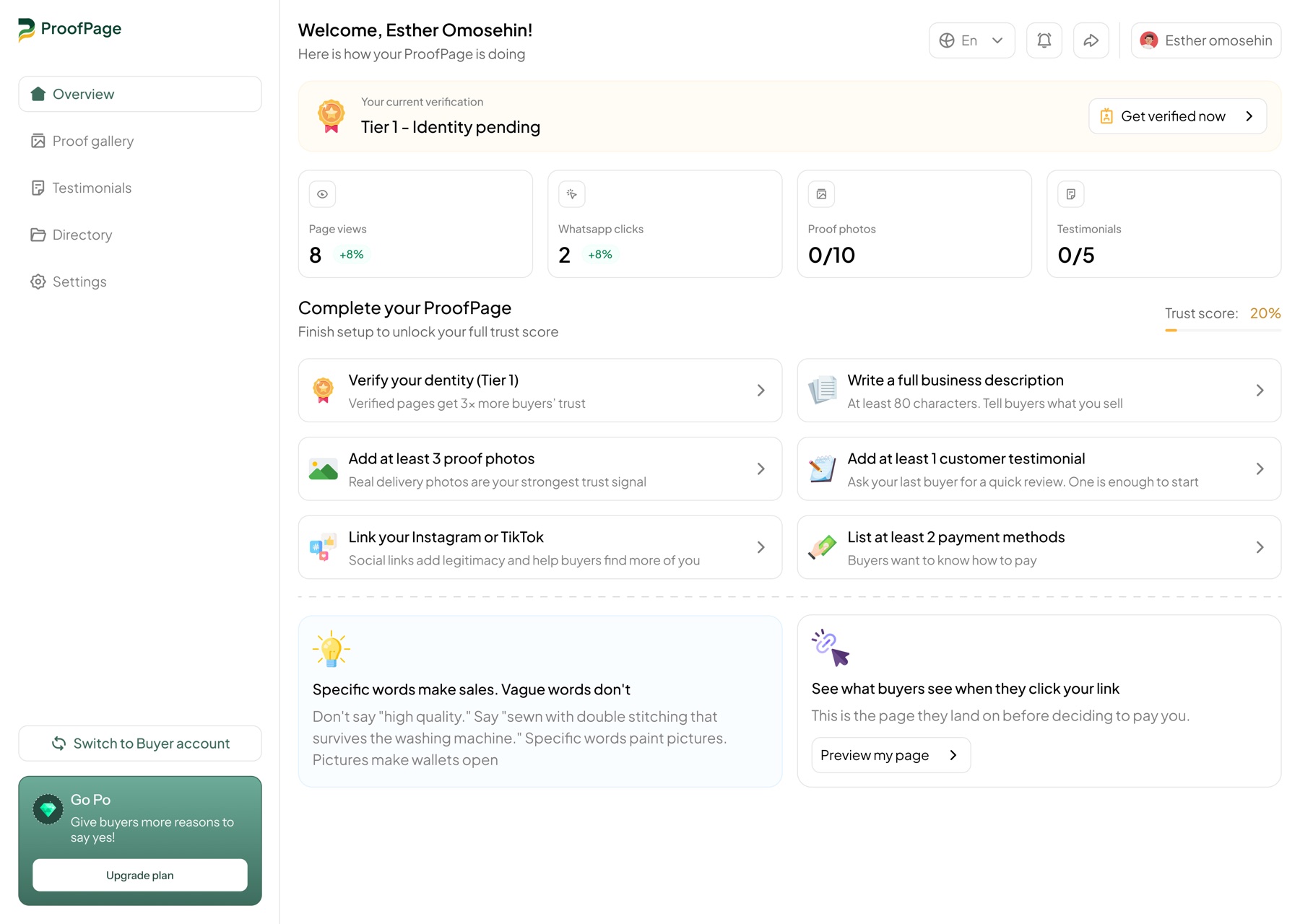
Two sides of trust
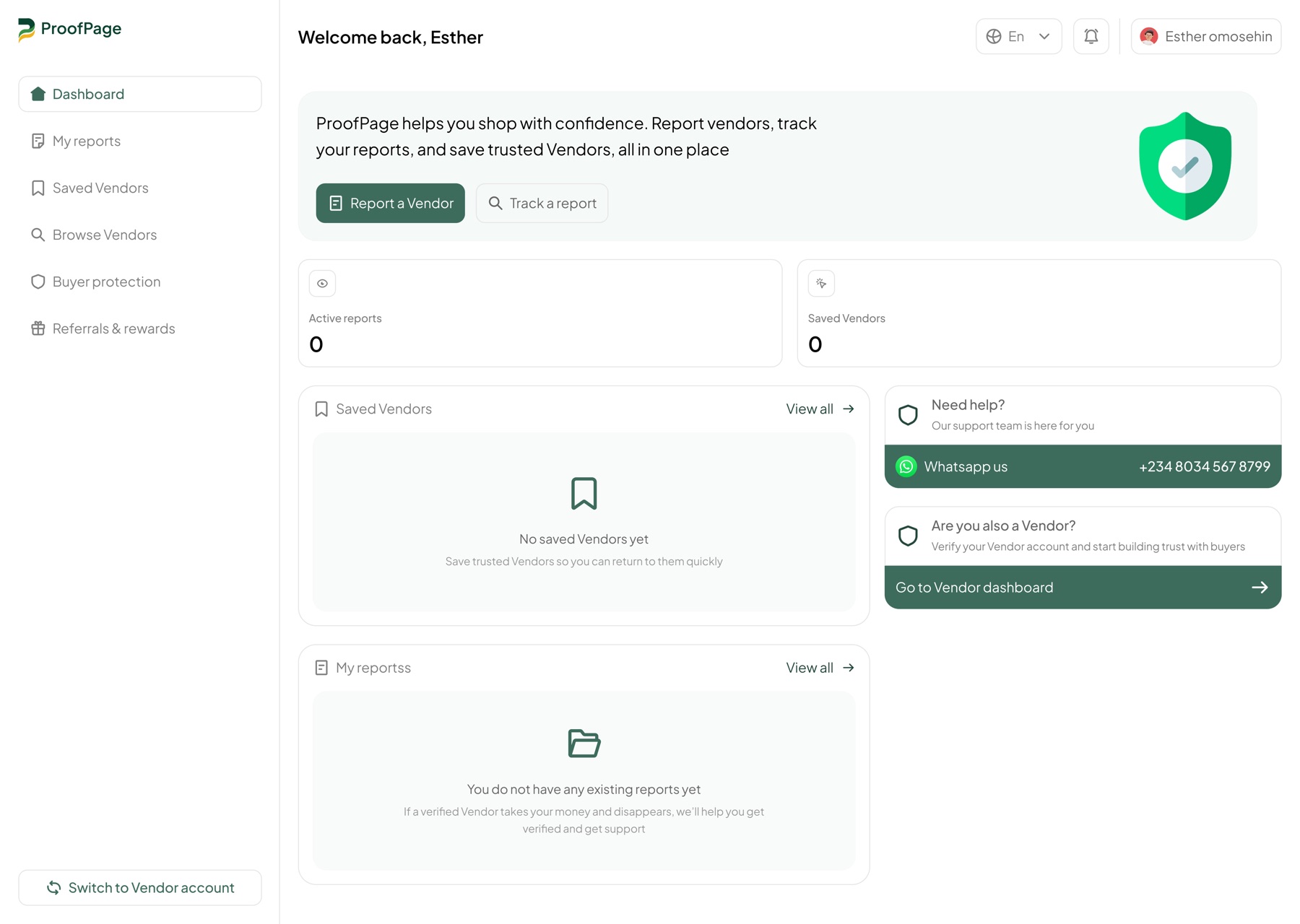
Different dashboards for different decisions.
Vendors see the work required to strengthen their page. Buyers see reports, saved vendors, support, and protection without inheriting the vendor's setup complexity.
Portable credibility
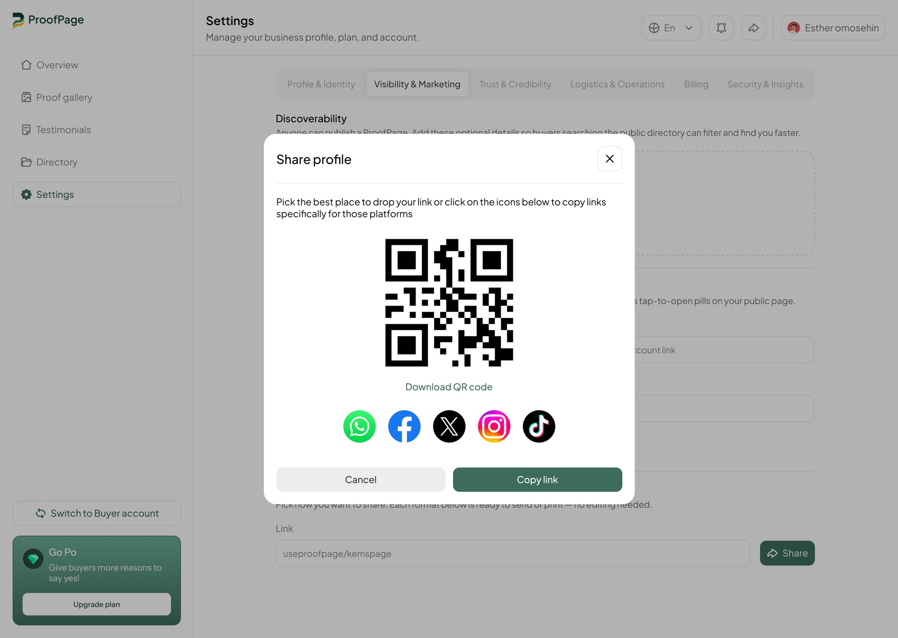
Trust had to travel beyond the platform.
A public ProofPage can be shared directly or through a QR code, giving vendors a reusable trust surface wherever a buyer first encounters them.
The point
Trust should not be one badge.
It should be a system of clear, separated signals: what has been verified, what proof exists, and what protection applies. That lets buyers make their own judgment instead of relying on a platform's single-word assurance.
Reflection
The harder version made credibility understandable.
It would have been easier to ship a single “trusted” label. The real design work was resisting that simplicity and designing several distinct but connected pieces: verification, protection, and proof.