Overview
A product brand needed more than good-looking screens.
Klone needed a clearer brand and product direction. The product had useful screens and strong ideas, but it needed a more recognizable identity and a system that could scale across product and marketing.
I shaped the brand direction, interface style, reusable assets, and product presentation so Klone could feel like one connected product rather than a collection of separate outputs.
4 connected surfacesPublic web, customer product, vendor operations, and campaign assets.
The reality
The pieces worked. The system behind them did not.
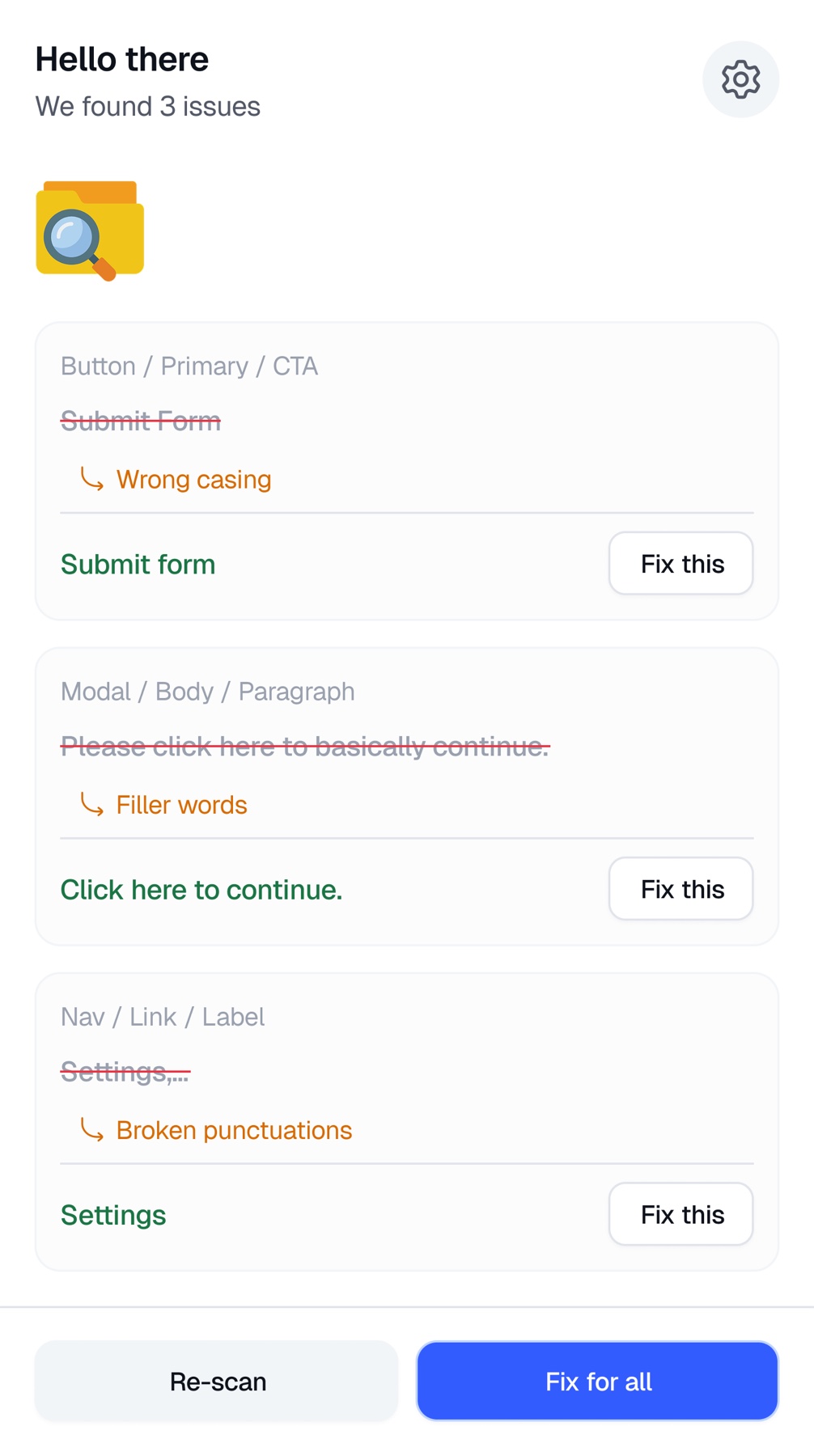
Product screens, marketing visuals, dashboard views, and mobile experiences did not always feel like they belonged to the same product. Every new asset risked becoming another isolated design decision.
The problem was not a lack of visuals. It was the absence of a strong system connecting them.
The design goal
Define a clearer identity without losing product usability.
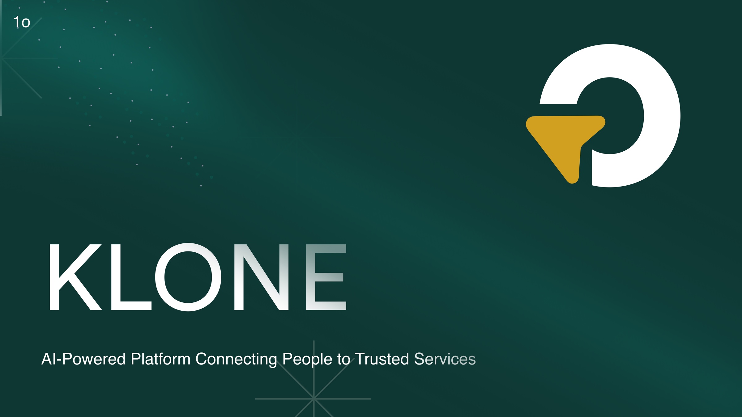
I needed a direction bold enough to be recognizable and disciplined enough to support real product work. That meant aligning color, typography, layout rhythm, interaction patterns, and marketing expression before polishing individual screens.
Stronger identity
A visual point of view that could be recognized without relying on the logo.
Product alignment
Shared rhythm across cards, navigation, states, and content hierarchy.
Reusable patterns
Assets and layouts designed to move between product and marketing.
Controlled expression
Personality in high-impact moments, restraint in utility-heavy flows.
My role
I worked across identity, interface, and product presentation.
I set the visual direction, explored how it behaved in product, created reusable assets, and designed the screens that connected customer discovery with vendor operations. The work required brand judgment and product judgment at the same time.
Key design decisions
Four decisions held the work together.
Direction before decoration
I defined tone, type, color, and layout principles first so later screens had something concrete to answer to.
The interface carried the brand
Buttons, cards, navigation, empty states, and mobile screens shared one visual rhythm without sacrificing clarity.
Reusable by default
Patterns were built for landing pages, onboarding, dashboards, announcements, and campaigns instead of one-off use.
Personality with restraint
Expressive moments were concentrated in discovery and promotion. Operational screens stayed quieter and easier to scan.
Landing and marketing direction
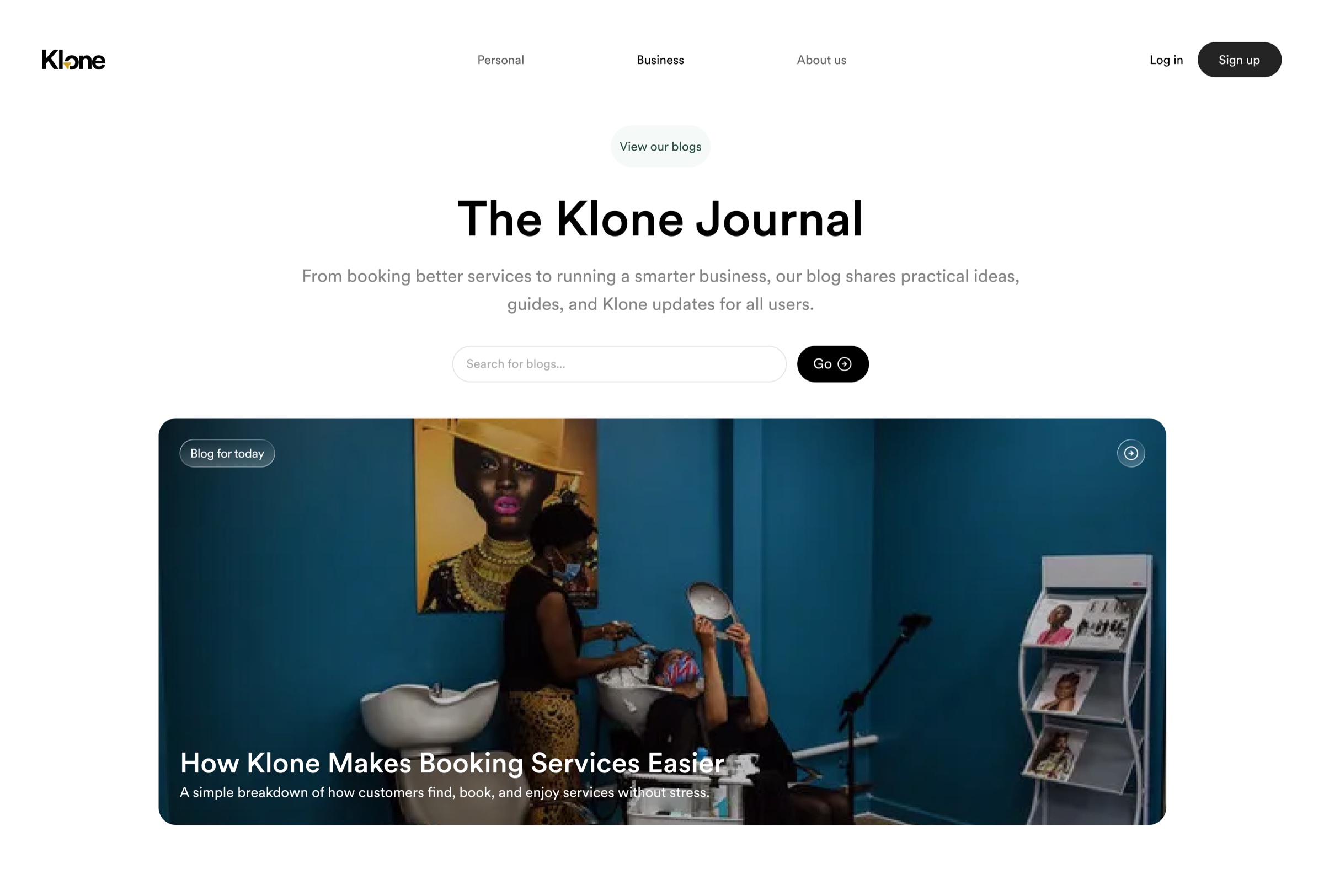
The public experience established the promise.
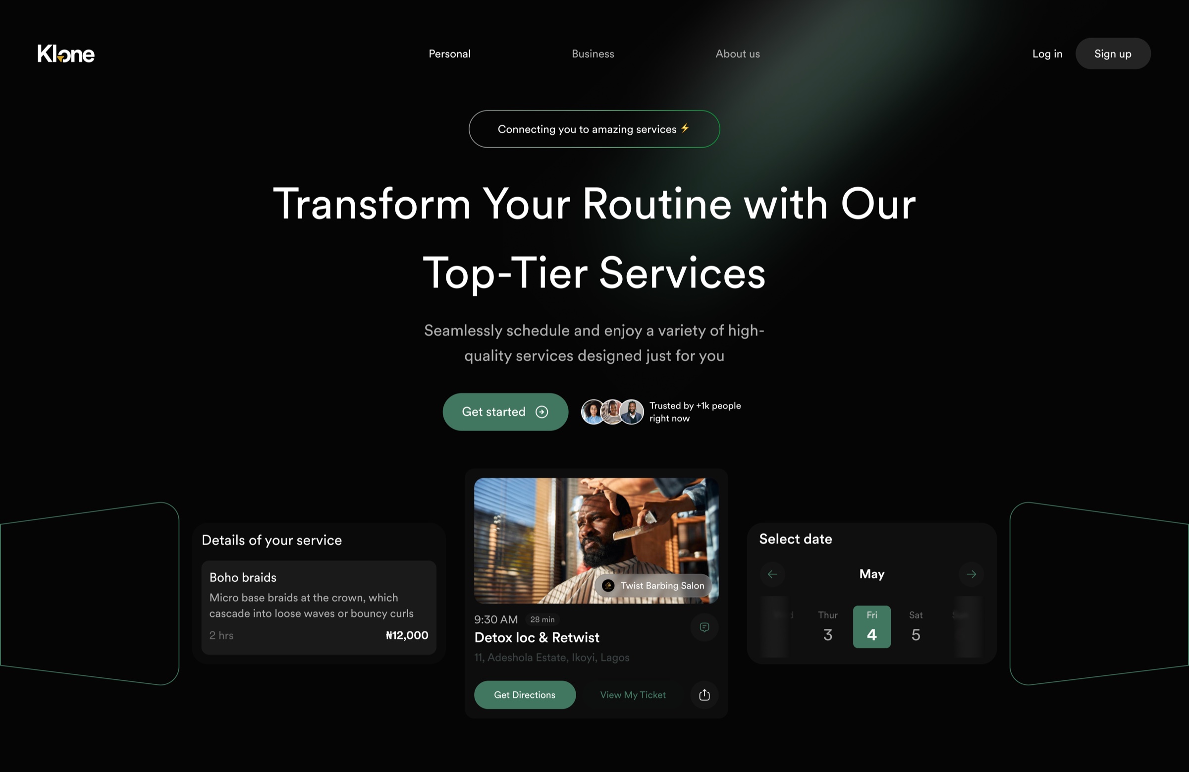
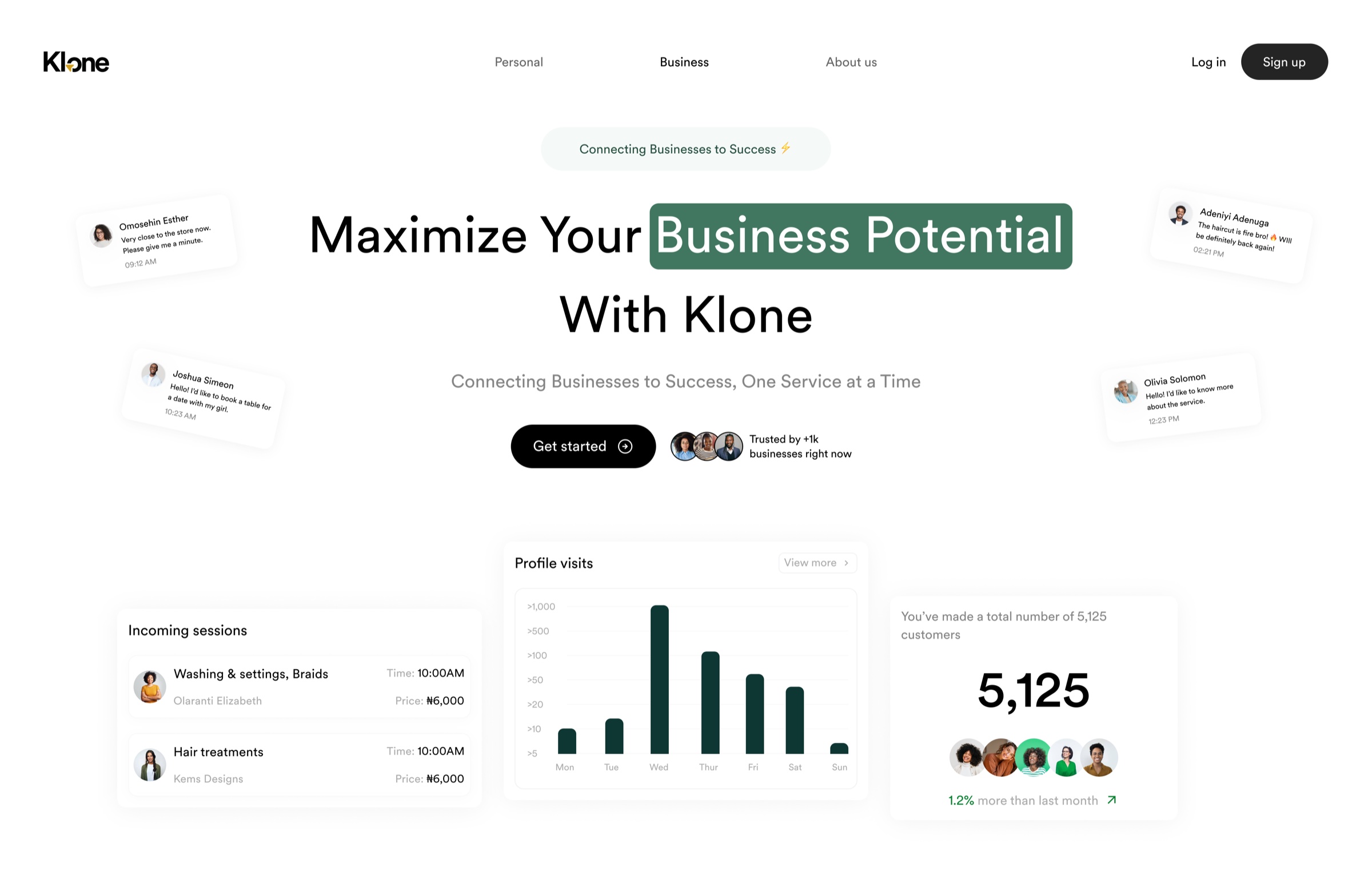
The web direction introduced Klone with a confident editorial voice, then adapted that same system for business audiences and content without becoming a different brand each time.
Customer discovery
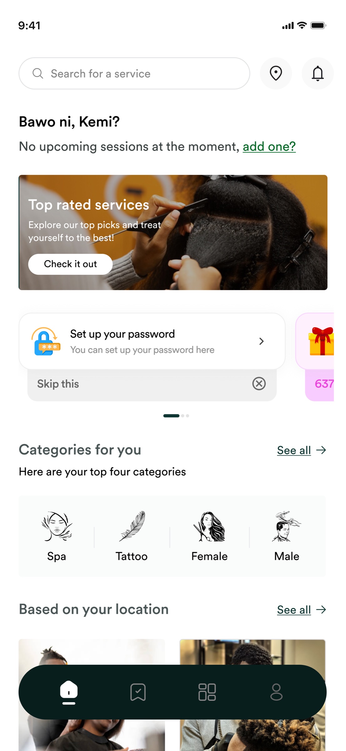
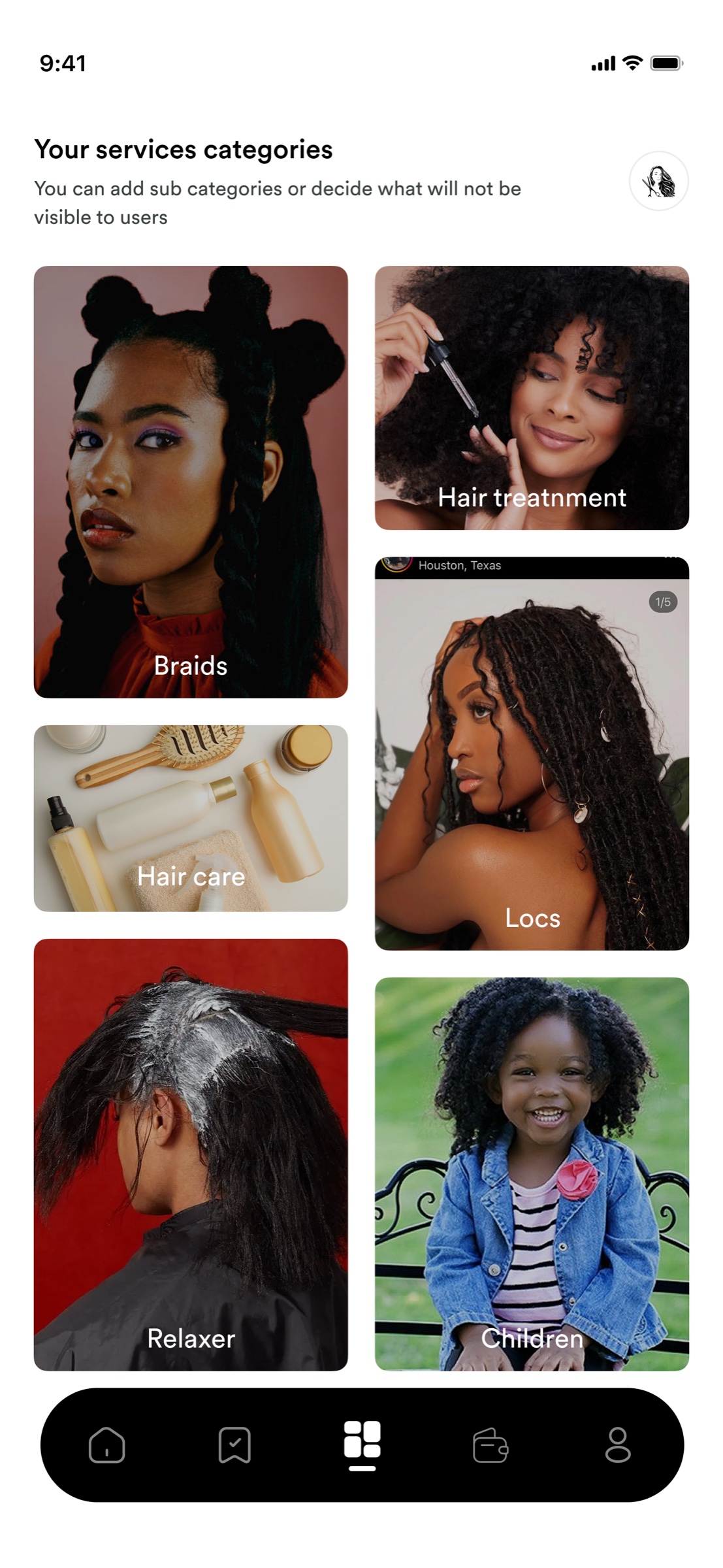
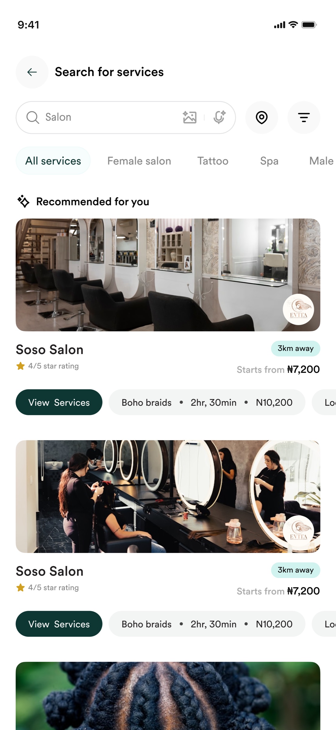
Search became a product capability, not just an input.
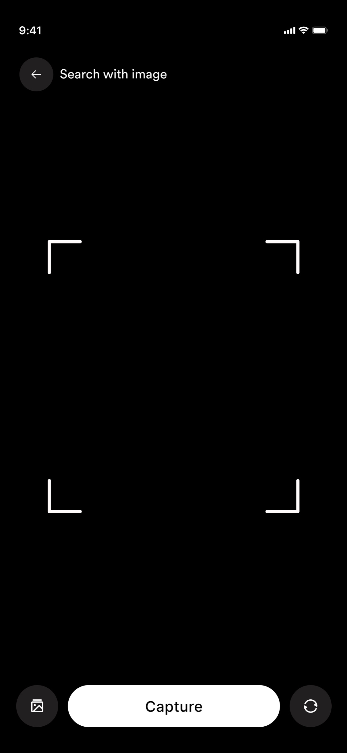
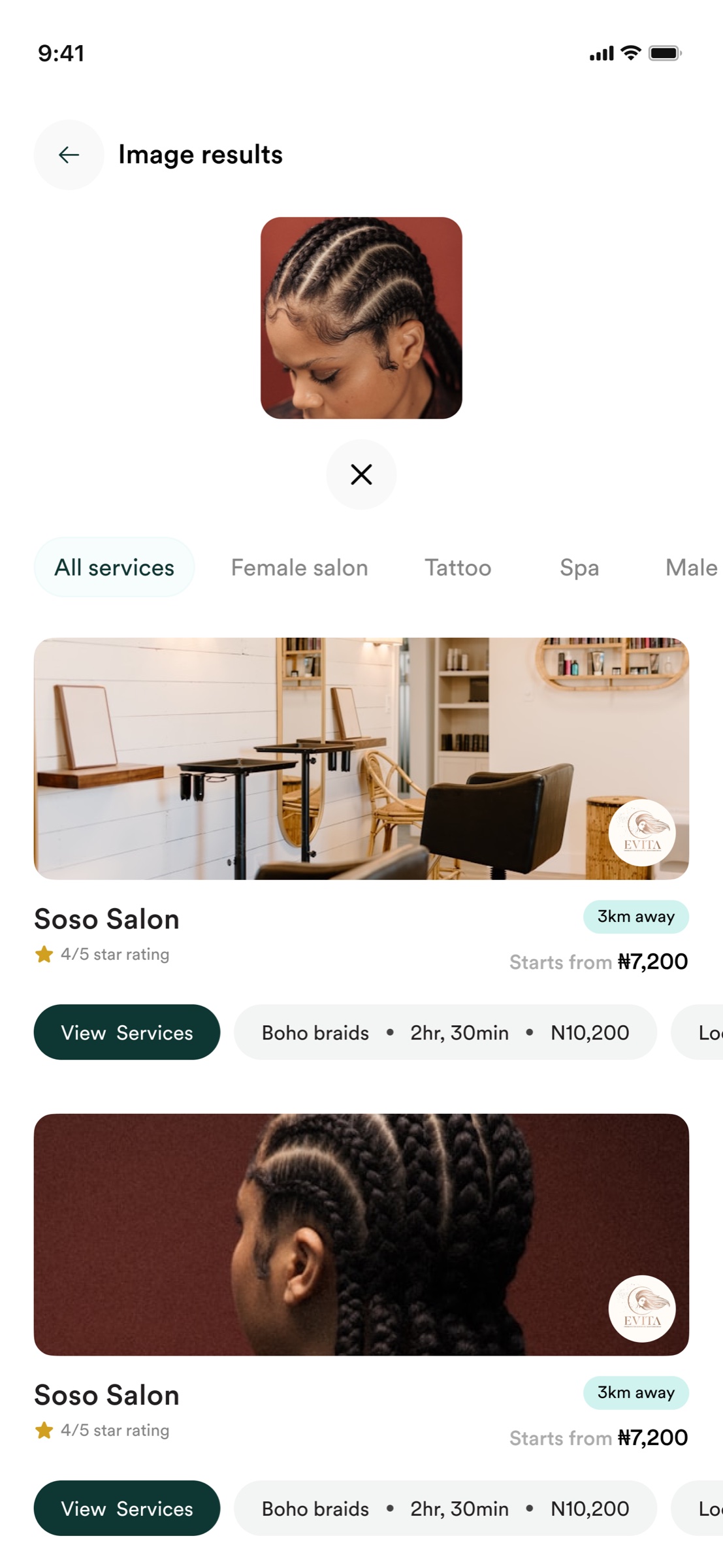
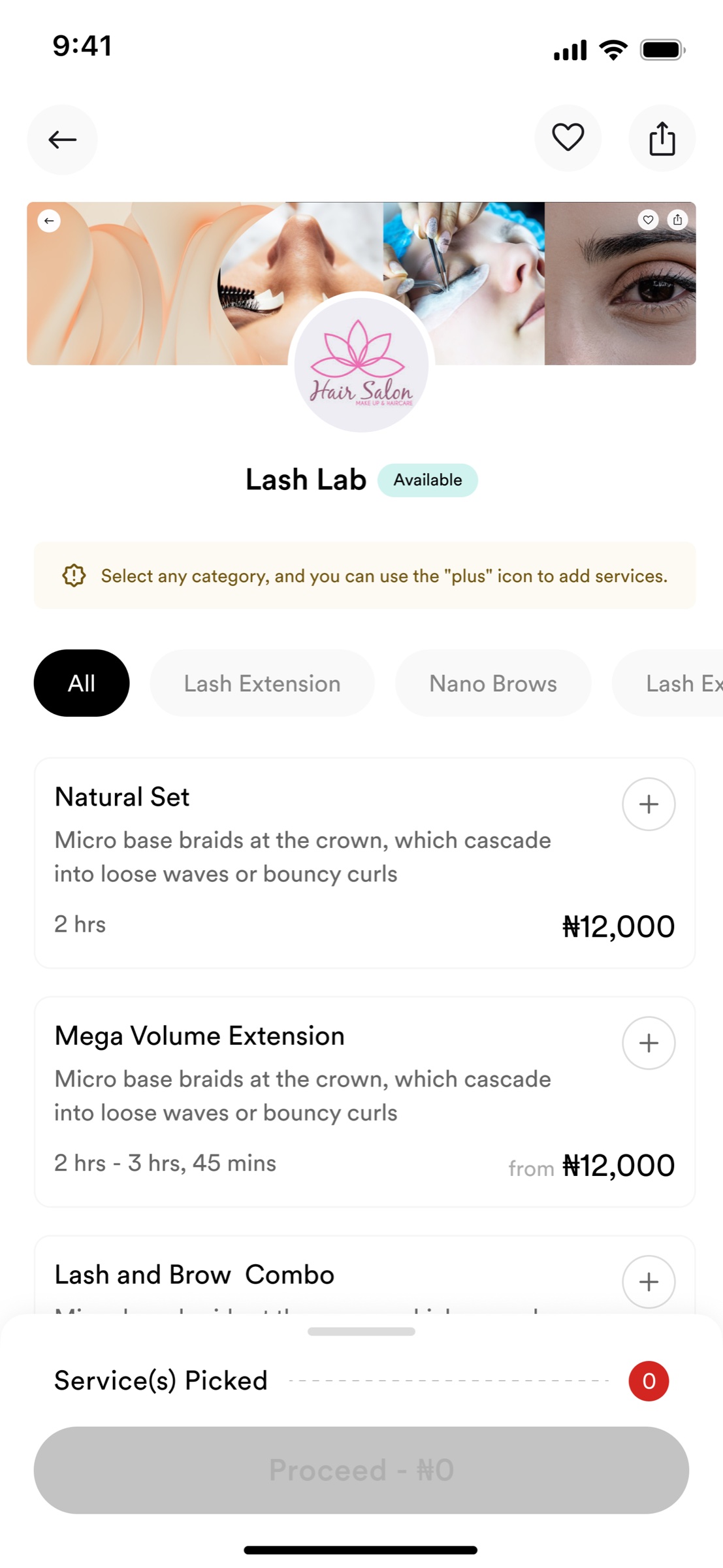
Customers could browse categories, search directly, or use an image to find a service. I treated those as three routes into the same discovery model so results remained comparable.
3 discovery routesCategory browsing, text search, and image-led search.
Vendor operations
The same system had to support work, not only discovery.
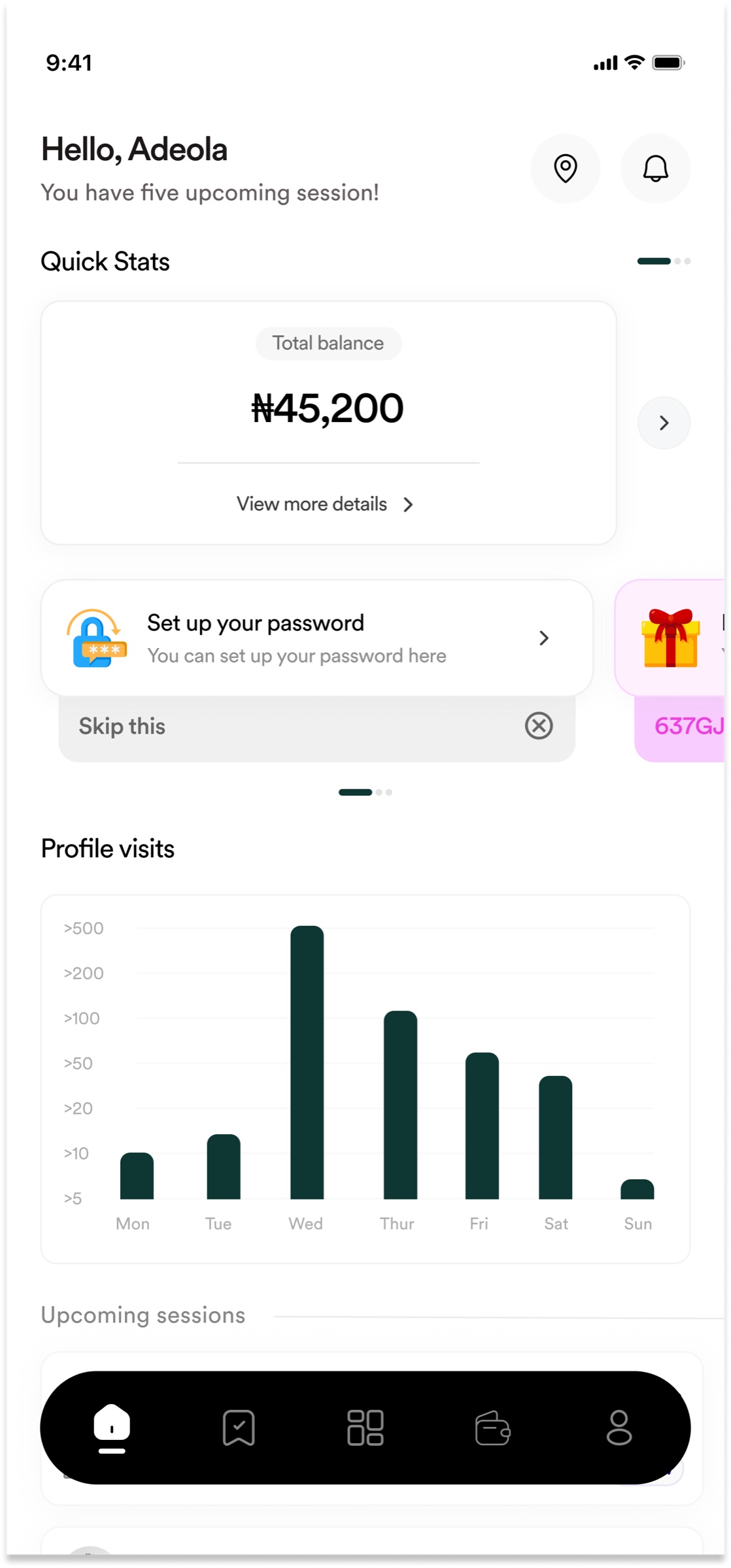
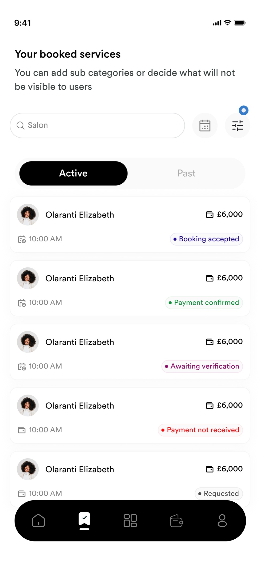
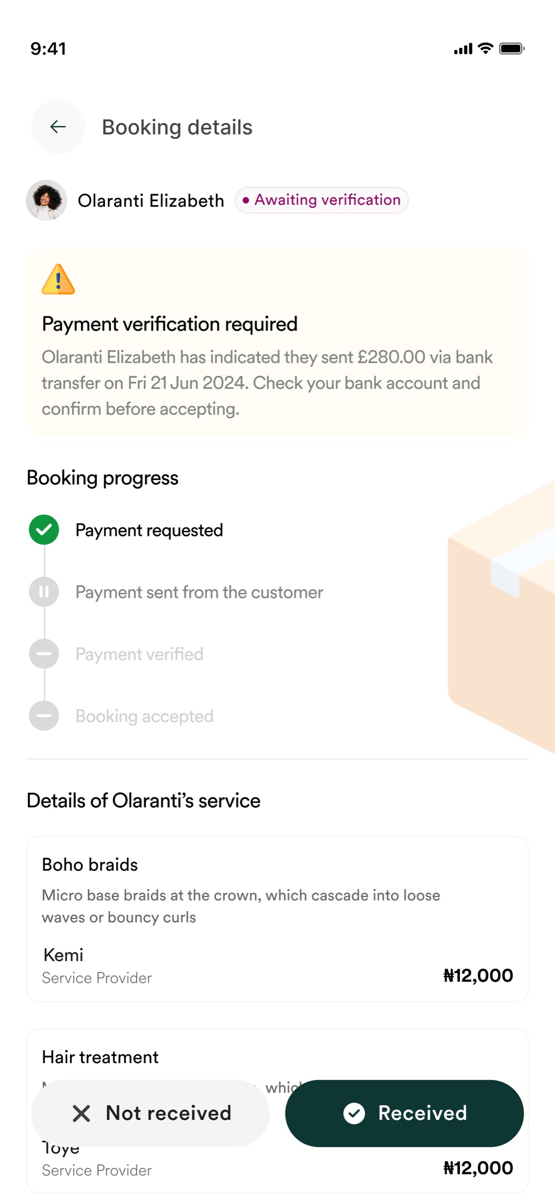
Vendor screens prioritize status, money, and next actions. The visual language stays recognizably Klone, but hierarchy becomes denser and more operational because the job is different.
5 booking statesRequested, accepted, awaiting verification, payment confirmed, and payment not received.
Referral and promotional flows
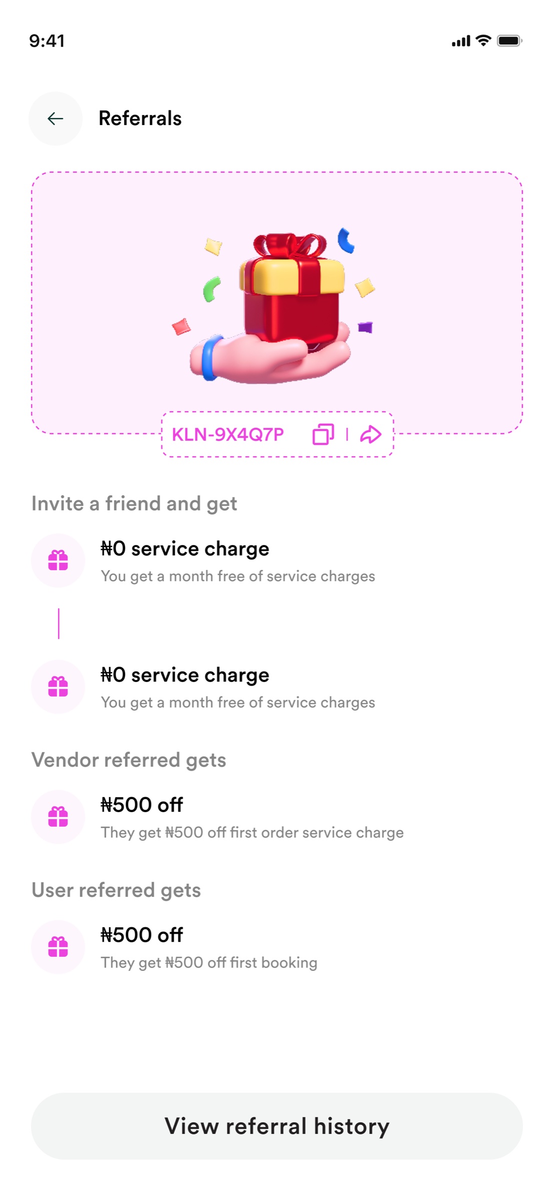
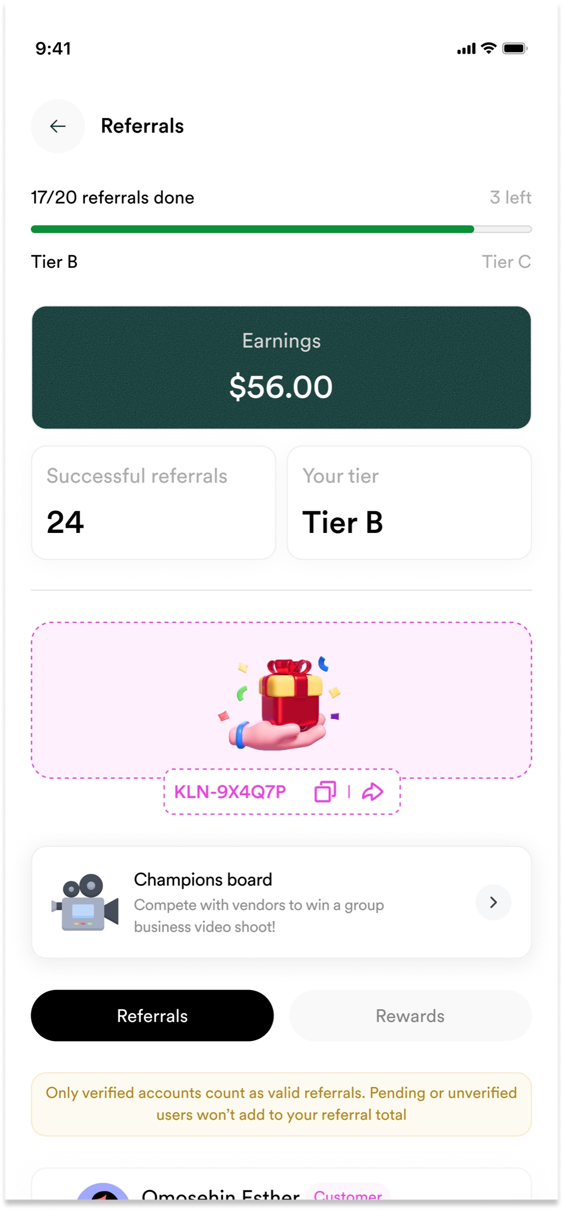
Growth moments used more expression, not less structure.
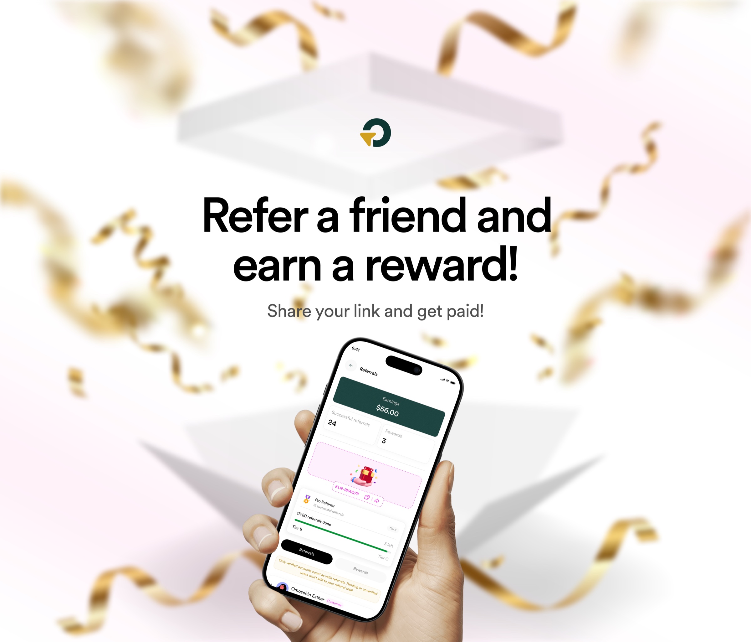
The referral experience connects progress, eligibility, earnings, and campaign communication. It is more playful than the booking flow, but still uses the same hierarchy and product language.
What changed
From scattered visuals to a connected product brand.
Before
Screens and assets worked independently. Product and marketing had no reliable shared rhythm.
After
One direction connected web, mobile, vendor operations, and promotional communication.
Reflection
Brand became useful when it behaved like a product system.
Klone reinforced that identity is not a visual layer added after the product is designed. The strongest work came from connecting brand, interface, and reusable assets so different touchpoints could feel related while still doing different jobs.